It’s that time of year again. InfoVis abstracts have been submitted, and lots of people are scrambling to finish their full submission.
I was curious about the distribution of keywords in the submissions, so I visualized some of the data available to the program committee (PC). After checking with the chairs, I thought others might be curious about the results.
Note that these are only abstracts, so there will probably be some attrition before the full paper submission deadline. To see a MUCH more thorough analysis of multiple years and venues, check out http://keyvis.org
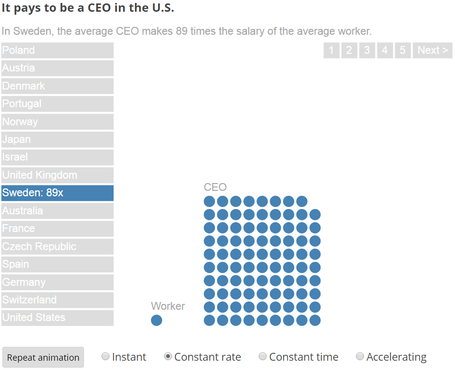
It’s always amazing how many basic visualization questions are yet to be answered. Robert Kosara raised one yesterday: What is the most effective way to show large scale differences?
Rather than using a bar chart to represent values, he made a demo that sequentially shows dots to demonstrate how many more times a CEO makes than a worker. His solution looked compelling, but I realized that I don’t know of any literature in vis that has empirically tackled this problem. A goal as simple as visualizing a pair of values of very different scale has few (if any) guidelines.
Furthermore, although there have been a few papers on animation in charts (e.g. [2, 4]), the basic approach of using animation to represent a single value still has many unanswered questions.
Robert’s demo used both numerocity and duration of the animation to visualize each value. I forked his code to make a demo of some alternative animation styles (options at the bottom), but I don’t know of any literature that hints if or why one would be better than another: Continue reading →
Neil deGrass Tyson recently noted that the 2008 bank bailout was larger than the total 50 history of NASA’s budget. Inspired by that comparison, I decided to look at general science spending relative to the defense budget. How do we prioritize our tax dollars?
This information quest also gave me an opportunity to try using Tableau to visualize the results.
With science spending in green and military spending in red, the difference is enormous. In fact annual military spending is greater than the total cost of NASA’s entire history (adjusted for inflation).
Note: Tableau Public went down while I was trying to make this chart. During that time, I couldn’t save or open anything! The lesson here is to be cautious when using Tableau Public.