It’s always amazing how many basic visualization questions are yet to be answered. Robert Kosara raised one yesterday: What is the most effective way to show large scale differences?
Rather than using a bar chart to represent values, he made a demo that sequentially shows dots to demonstrate how many more times a CEO makes than a worker. His solution looked compelling, but I realized that I don’t know of any literature in vis that has empirically tackled this problem. A goal as simple as visualizing a pair of values of very different scale has few (if any) guidelines.
Furthermore, although there have been a few papers on animation in charts (e.g. [2, 4]), the basic approach of using animation to represent a single value still has many unanswered questions.
Robert’s demo used both numerocity and duration of the animation to visualize each value. I forked his code to make a demo of some alternative animation styles (options at the bottom), but I don’t know of any literature that hints if or why one would be better than another:
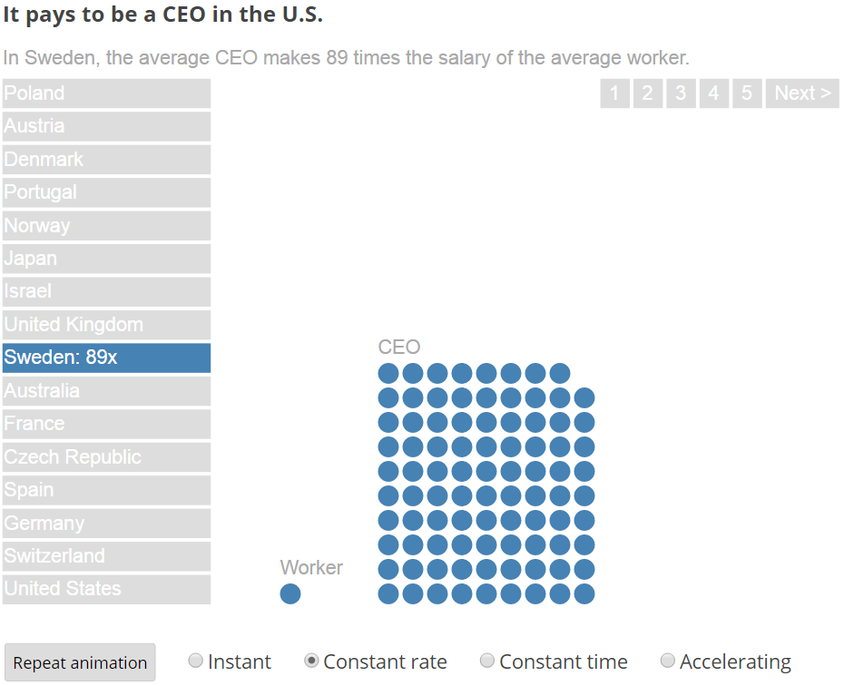
It pays to be a CEO in the U.S.
Some questions raised:
- Is numerocity better than length at presenting large multiplier differences?
- Does mapping animation duration to a data value improve acuity, memorability, or tangibility?
- Although the Steven’s power coefficient is known for long durations [1], what is the descriminability of short durations?
- If the total duration of the animation were kept constant, the speed and flicker rate [3] would map to the value. How do those visual features compare with duration?
- Do people have to watch the entire animation to benefit from it? Or will impatient people who stop the animation early misperceive the value? Can that be solved by acceleration?
The basic answer is… we don’t know.
References
- P Burnett. “Time Cognition and Urban Travel Behavior”. Geografiska Annaler. Series B, Human Geography. Vol. 60, No. 2 (1978)
- J Heer, G Robertson. “Animated Transitions in Statistical Data Graphics”. IEEE Information Visualization (2007)
- D E Huber, C G Healey. “Visualizing Data with Motion”. IEEE Visualization (2005)
- G Robertson, R Fernandez, D Fisher, B Lee, J Stasko. “Effectiveness of Animation in Trend Visualization”. IEEE Information Visualization (2008)
Great posting! Another paper in the area is Effectiveness of Animation in Trend Visualization, which IMHO has many gaps and issues. Barbara Tversky has also done a lot of work in the area, but not much that’s specific to visualization.
There are certainly huge gaps still, and many prejudices against animation. A wide open field for somebody to do some good work in.
Thanks! I added the reference.