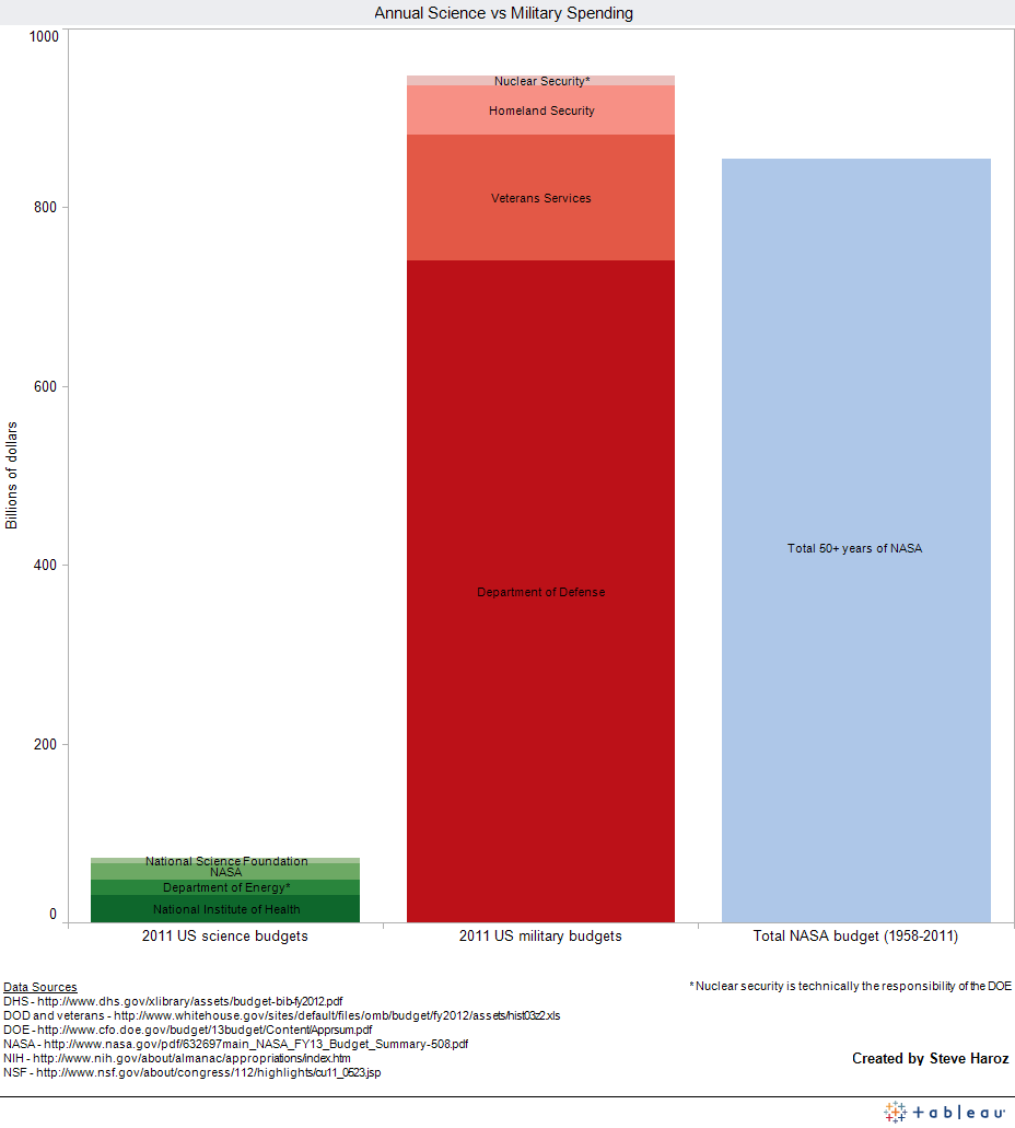
Neil deGrass Tyson recently noted that the 2008 bank bailout was larger than the total 50 history of NASA’s budget. Inspired by that comparison, I decided to look at general science spending relative to the defense budget. How do we prioritize our tax dollars?
This information quest also gave me an opportunity to try using Tableau to visualize the results.
With science spending in green and military spending in red, the difference is enormous. In fact annual military spending is greater than the total cost of NASA’s entire history (adjusted for inflation).
Interactive version hosted by Tableau
Note: Tableau Public went down while I was trying to make this chart. During that time, I couldn’t save or open anything! The lesson here is to be cautious when using Tableau Public.

Pingback: Corrected: Relative spending for science versus defense | D Gary Grady
I find this truly sad.
If your only sources are the ones listed then it seems that you have just taken the NASA budget for last year and multiplied it by 53 years to achieve 954 billion total for NASA historical spending. This is highly inaccurate, unscientific and misleading.
Hi GalwayBogger,
Thank you for informing me about what is and is not scientific. Had you asked how I derived the number rather than blindly assuming, I would have happily explained that I took the budget for each of the previous 50 years, accounted for inflation, and added them together.
Pingback: Gastos para Ciencia vs fuerzas armadas en EE.UU. | Lenni's place
Pingback: Enceladus Unveiled | novus advocatus scientiae
Pingback: Just So We’re Clear …. | novus advocatus scientiae