Graph Comparison
You will see several types of graphs.
Each indicates how long cars on a team took to finish a race.
There are 1-6 cars for each team.
Your task is to indicate which team on average took longer.
The experiment will take about 30 minutes.
Graph Comparison
Some of the graphs will be bar graphs.
Red bars represent the time that cars on Red team took to finish the race.
And blue bars represent the Blue team.
Here, the Blue team took longer on average.
Graph Comparison
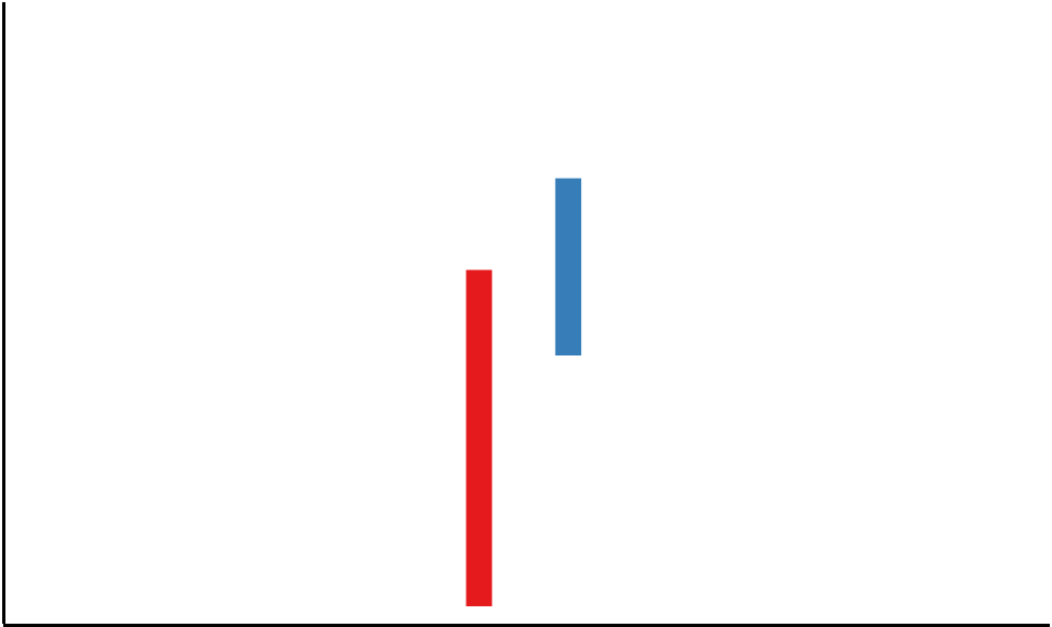
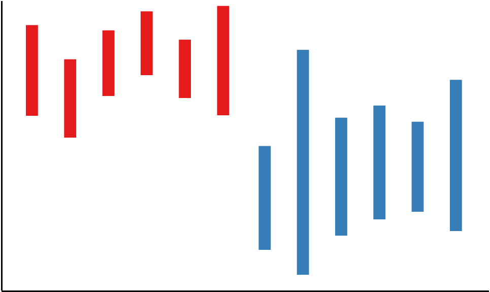
Some graphs will be "floating" bar graphs.
The length still represents the time each car took.
The floating position doesn't matter.
Here, the Red team took longer on average.
Graph Comparison
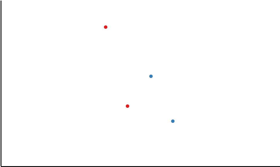
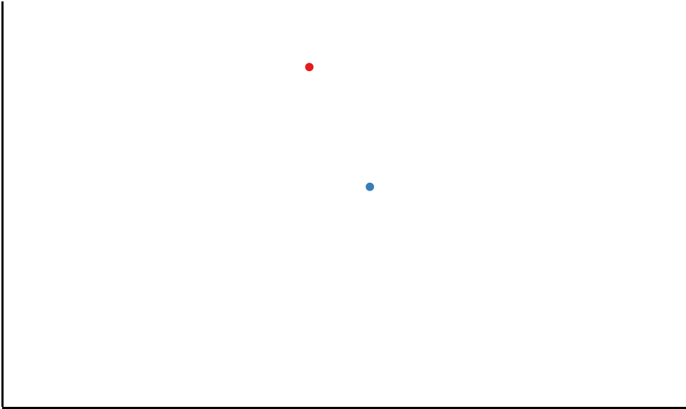
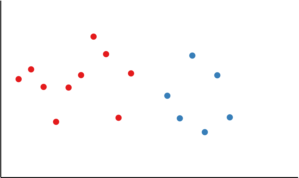
Some graphs will be dot graphs.
The heights of the dots represents the time each car took.
Here, the Red team took longer on average.
Graph Comparison
Some graphs have 2 cars per team.
Here, the Red team took longer on average.
Graph Comparison
Some graphs have 2 cars per team.
Here, the Red team took longer on average.
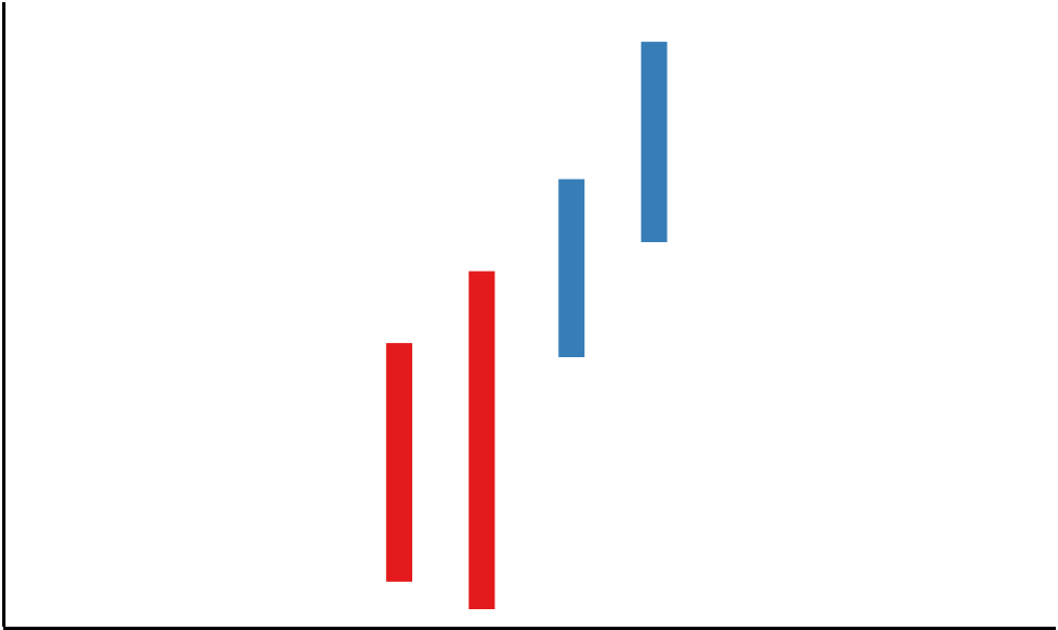
Graph Comparison
Some graphs have 2 cars per team.
Here, the Red team took longer on average.
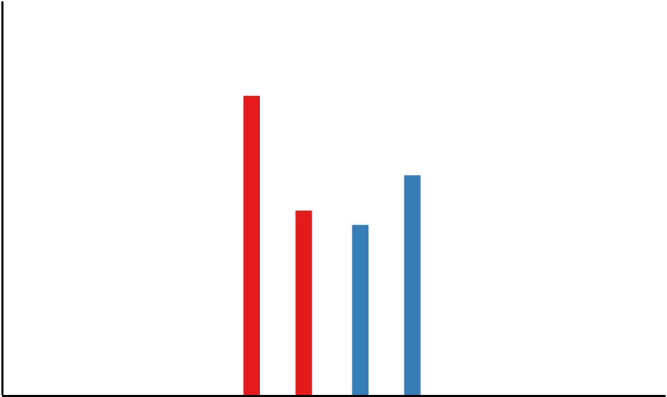
Graph Comparison
Other graphs have only 1 car per team.
Here, the Red team took longer on average.
Graph Comparison
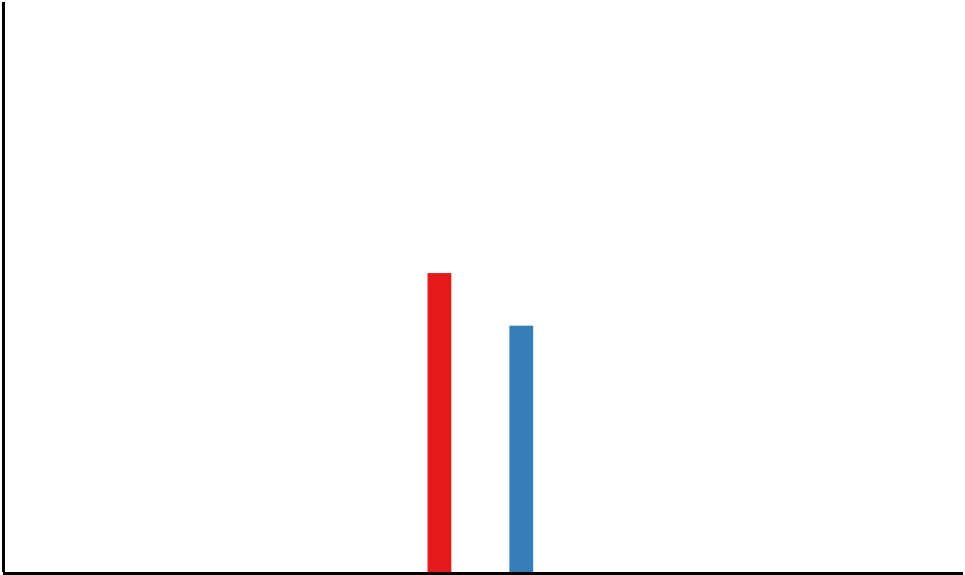
Other graphs have only 1 car per team.
Here, the Red team took longer on average.
Graph Comparison
Other graphs have only 1 car per team.
Here, the Red team took longer on average.
Graph Comparison
You will see several types of graphs.
Each indicates how long cars on a team took to finish a race.
There can be many cars for each team.
Your task is to indicate which team on average took longer.
The experiment will take about 30 minutes.
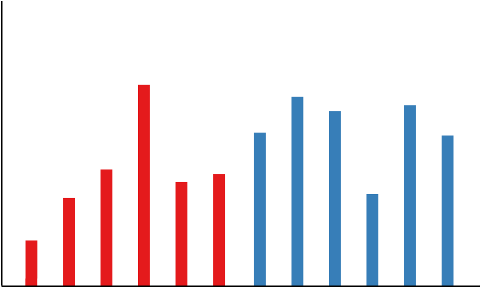
Graph Comparison
Some of the graphs will be bar graphs.
Red bars represent the time that cars on the Red team took to finish the race.
And blue bars represent the Blue team.
Here, the Blue team took longer on average.
Graph Comparison
Even though there is one tall red bar,
the Blue team took longer on average.
Graph Comparison
Some graphs will be "floating" bar graphs.
Length still represents the time each car took.
The floating position doesn't matter.
Here, the Red team took longer on average.
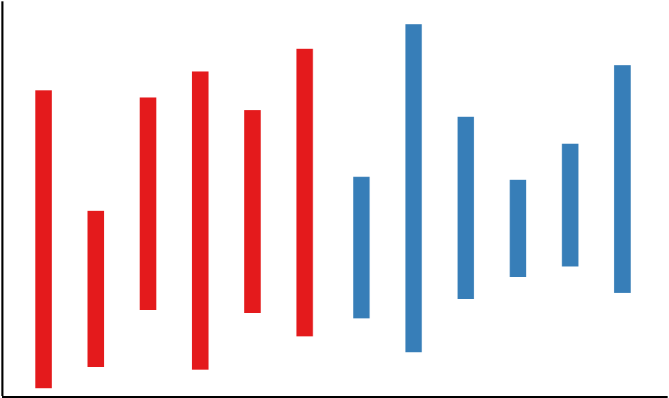
Graph Comparison
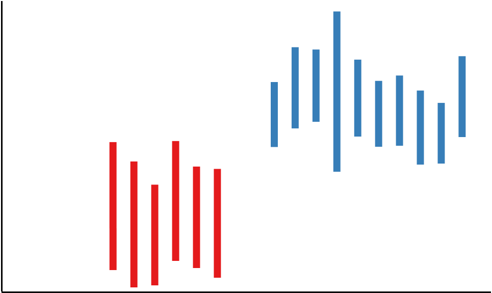
Remember that length, not location, matters.
Even though the red bars are higher,
The Blue team took longer on average.
Graph Comparison
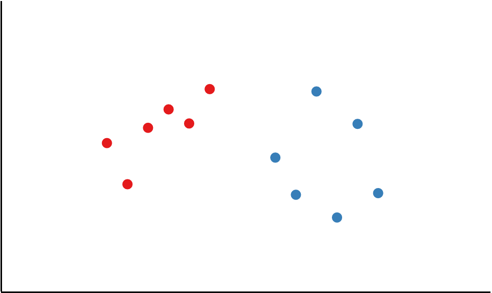
Some graphs will be dot graphs.
The heights of the dots represents the time each car took.
Here, the Red team took longer on average.
Graph Comparison
Some graphs have different numbers of cars per team.
Graph Comparison
Some graphs have different numbers of cars per team.
Even though the blue team has more cars,
Graph Comparison
Some graphs have different numbers of cars per team.
Even though the blue team has more cars,
and the blue team is floating higher,
Graph Comparison
Some graphs have different numbers of cars per team.
Even though the blue team has more cars,
and the blue team is floating higher,
and the blue team has one long bar,
Graph Comparison
Some graphs have different numbers of cars per team.
Even though the blue team has more cars,
and the blue team is floating higher,
and the blue team has one long bar,
the Red team took longer on average.
Graph Comparison
Height only matters for the dot graphs.
Here, the Red team took longer on average.
Overview
Laptop/Desktop: Use the left or right arrow keys on your keyboard to answer.
Tablet: Use the on-screen buttons and orient your tablet screen to be wide, not tall.
And please answer questions as quickly as possible!
The task will become more challenging over time.
The first several questions will let you know if you were right or wrong.
Just try your best.
Estimated duration: 30 minutes
Please respond faster
Uploading results...
Do not close the browser until the upload is complete.
All done! Thank you!
Copy this code into the Mechanical Turk survey: 0000