Collaborators
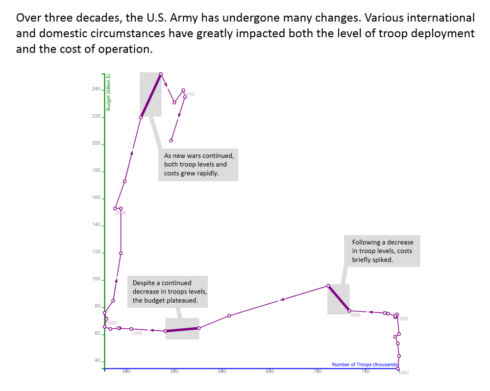
As far back as the 1790s, the connected scatterplot was used to visualize the cycle of a steam piston. Economists have since used it to depict data about unemployment and job openings over time.
Recently, journalists have begun using the technique to convey information to readers. But how well do those readers understand this unfamiliar format?
We tested how well viewers understand what the chart depicts, whether they can translate back & forth to more traditional formats, and whether they are more likely to engage with this new chart.
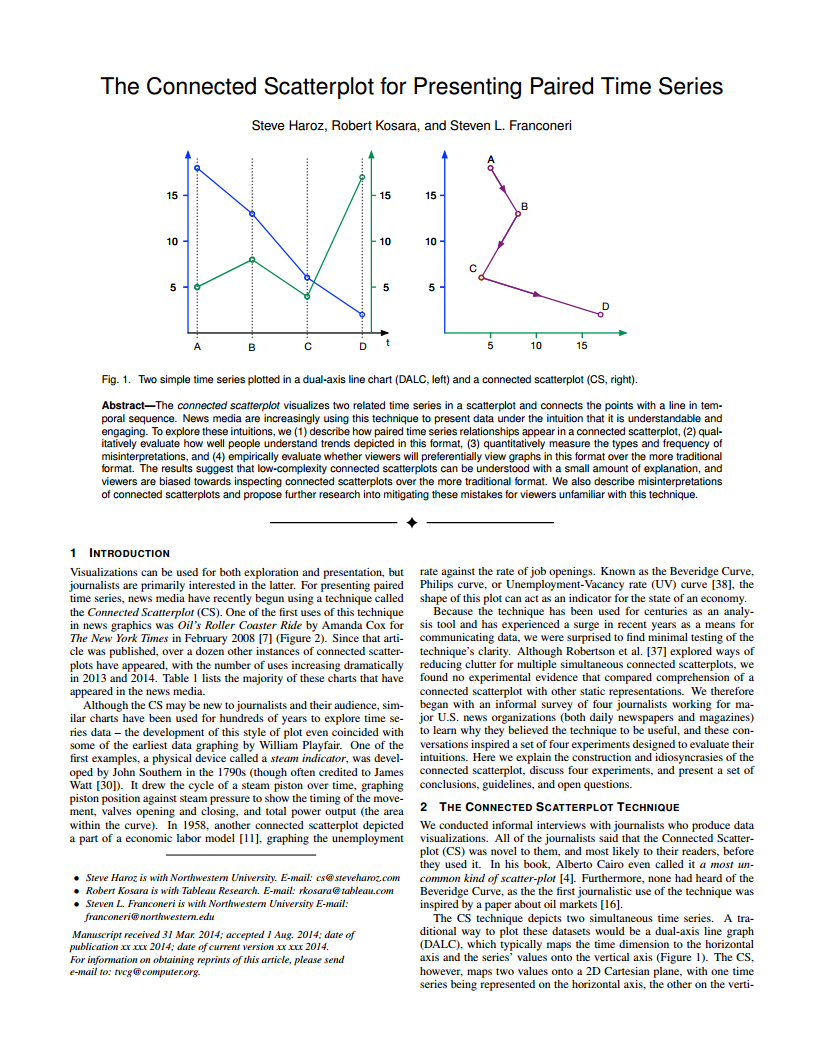
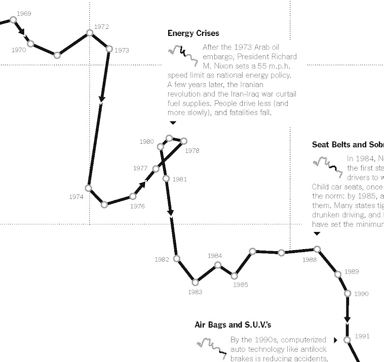
Viewers expected time to flow from left-to-right. When it flowed in the opposite direction, some viewers occasionally interpretted in reverse order. The direction of time should be strongly indicated to avoid this mistake. Arrows alone were not always sufficient.
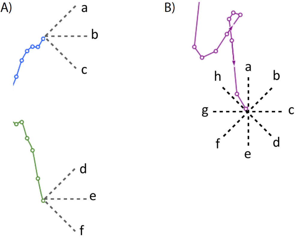
The vertical axis was more likely to be correctly interpretted. In a typical line graph, the vertical axis is quantitative data, and the horizontal axis is time. But in a connected scatterplot, the vertical and horizontal axes both typically depict values independant of time. Even though our displays clearly marked these axes, some viewers focused attention primarily on changes in the vertical axis, or labeled a change to only the vertical axis as a change on both axes.
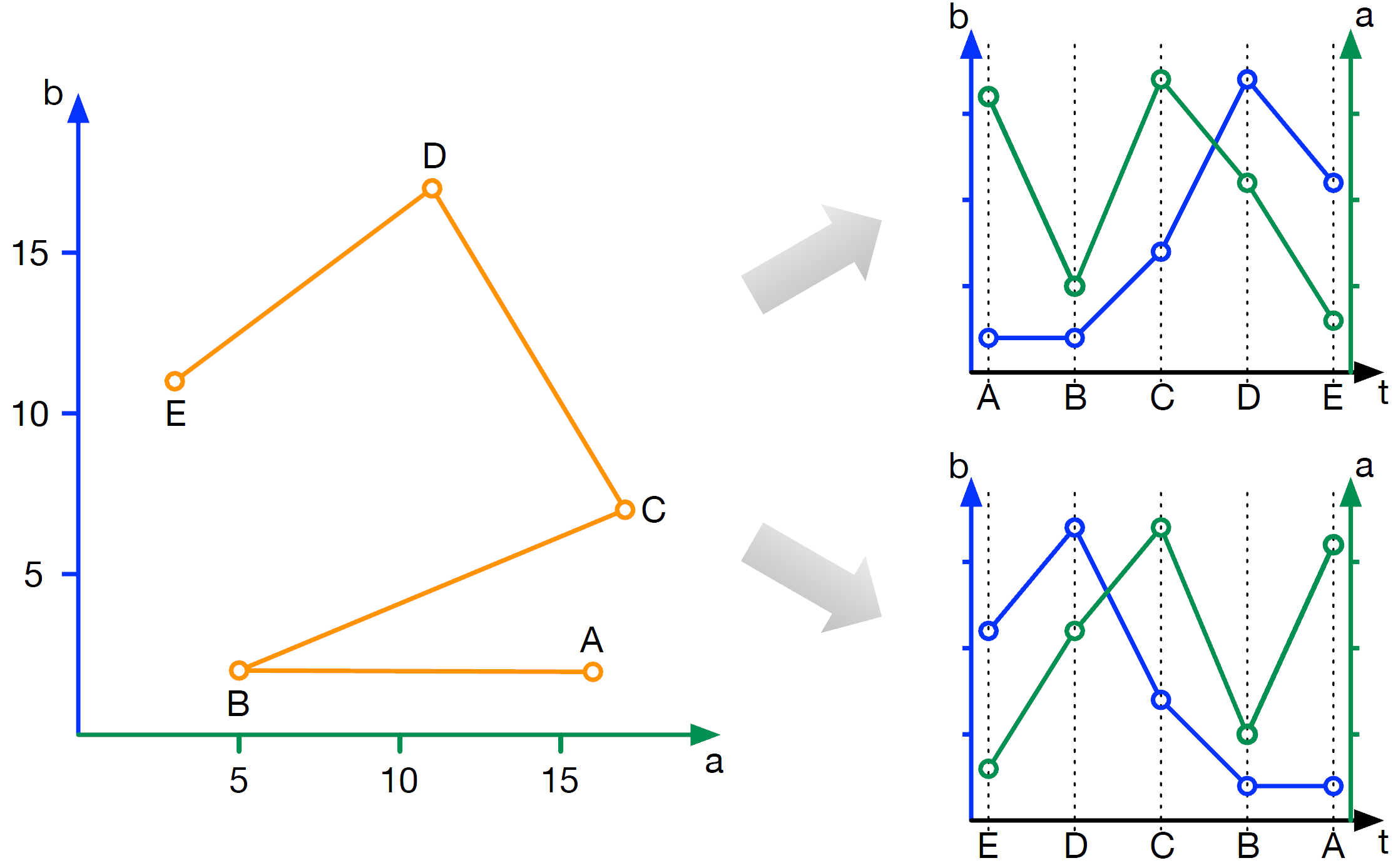
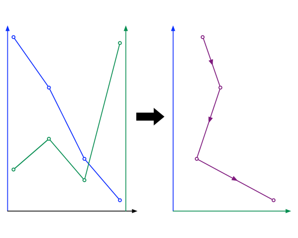
In a line chart, if the data underlying two lines is positively correlated, the lines will be locally parallel. If they are negatively correlated, they will be more perpendicular. What do relationships look like in a connected scatterplot? You have to think about that one, right? That is a problem for a graph format intended to show relationships in data. Go ahead and take a moment to find the answer for yourself, using the interactive display above.
The answer is that positive correlations show up as relatively diagonal lines along the ‘forward slash’ axis of the connected scatterplot, while negative correlations show up on the ‘backslash’ axis. Our viewers noted correlation relationships many dozens of times in traditional formats, but only a handful of times in the new format. Viewers need to be taught how to see these patterns.
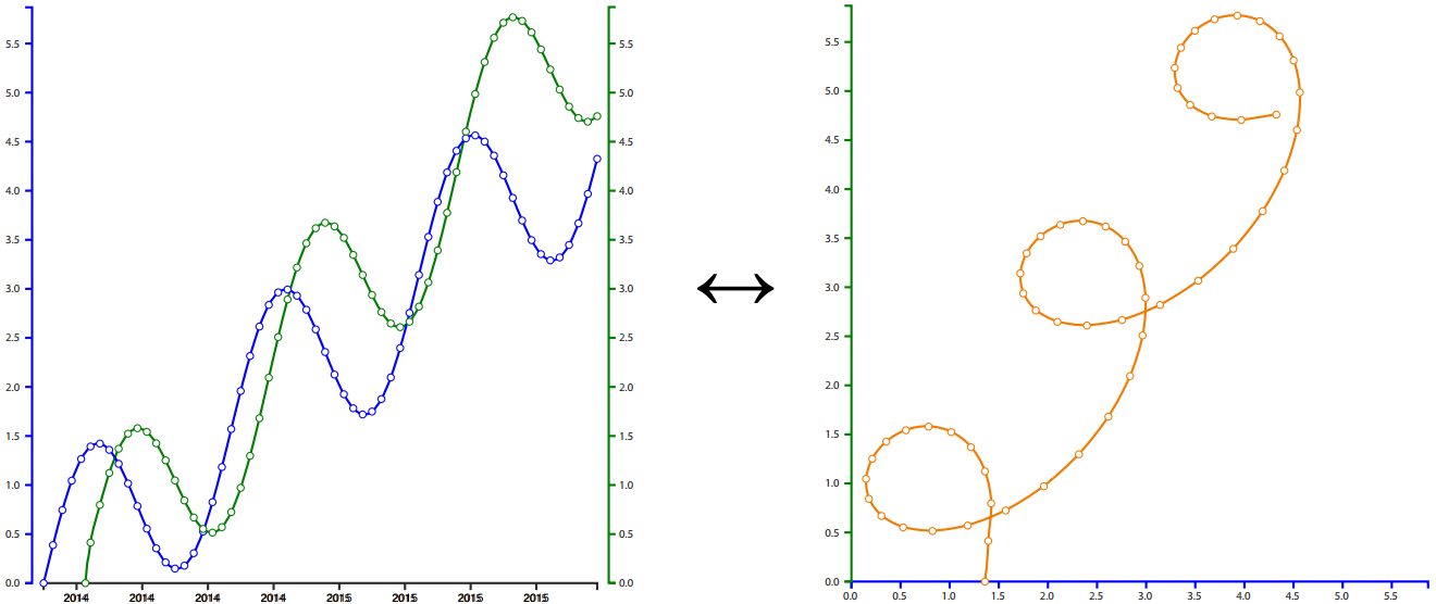
In a connected scatterplot, what does it mean when the line forms a loop? This feature reflects a potentially important pattern in the data, and one that can be tough to detect in more traditional formats. The answer is in our paper, linked above.
When given the choice to browse examples of either connected scatterplots or more traditional formats, our viewers initially browsed those in the newer format, suggesting that it may be an effective way to draw people into a story.
Haroz, S., Kosara, R., Franconeri, S. (2016) The Connected Scatterplot for Presenting Paired Time Series. IEEE Transactions on Visualization and Computer Graphics.
DOI:10.1109/TVCG.2015.2502587