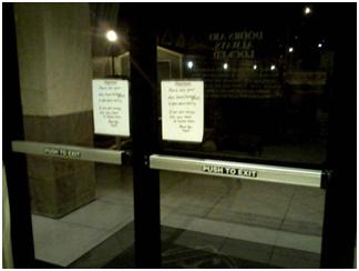
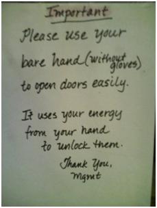
Read the Fucking Manual: the sure sign of a bad user experience. Well now, the door has gotten even worse. Because no one read the instructions, people kept pushing on the door with their sleeves or with gloves. Consequently, one of the doors is broken, so they added another page stating to use the other door.
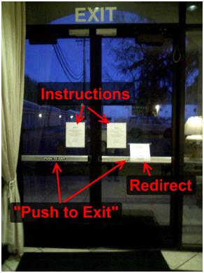 Now a simple door has three pages of text instructions and a “Push to Exit” sign on each door. On the bright side, the pages are now typed, so it’s classy 😉
So let’s redesign and eliminate the need for English:
The push bar – As I wrote last time, make the temperature sensitive control into either a physical control or a touch-sensitive control. Say goodbye to the no glove rule.
Push to Exit – The glass is clear, so I know it’s an exit. The “to exit” part can go. And “push” is intuitive for a horizontal bar, so the whole thing can go.
Broken door – Sometimes stuff breaks. We want to direct people to the other door. A couple big X’s on the door should stop them from using it. And an arrow on the door would redirect them. No words needed. If we wanted to add a simple note to residents, something like this should suffice: “Broken. Will on fixed on…”. Anything more is just annoying.
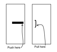
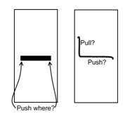
A great sketch to go out on a happy note:

