
Reviewing can be a major time-expenditure, and it’s done by volunteers. So it is especially audacious that many reviewing systems seem to avoid basic usability courtesies that would make the process less obnoxious.
What would a polite reviewing system look like? How would it behave towards reviewers? This is my proposal.
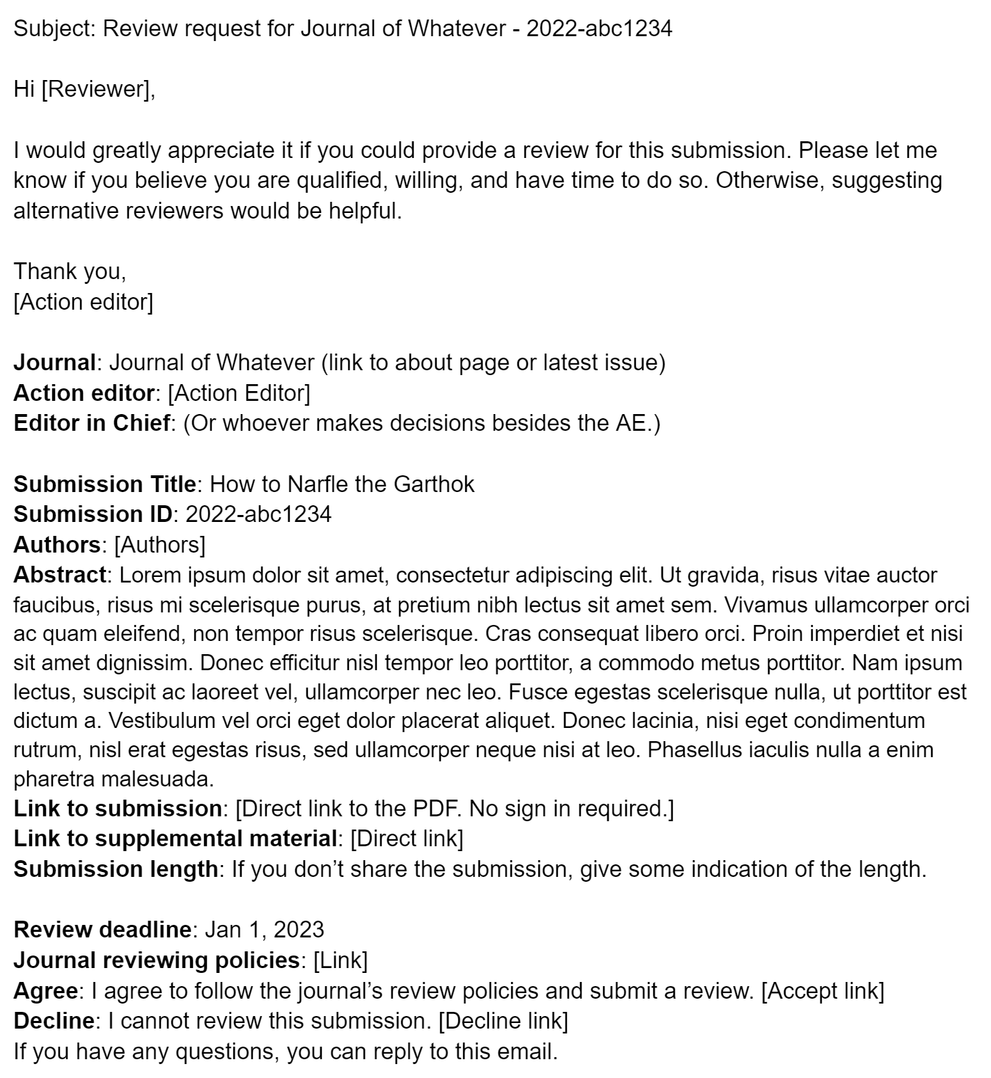
The email request
The request needs to get a lot of info across, so potential reviewers can assess if they are qualified and willing to make the time commitment. Don’t bog it down with a bunch of unnecessary crap. Avoid talking about your “premier journal”, its “high standards”, and any other bullshit loftiness. Get to the point.
Here is a review request template. Notice that the information is clearly organized. Besides the obvious details, it includes:
- The names of both the action editor and whoever else makes decisions about this submission, like the EiC. We deserve to know who we’re reviewing for.
- A direct link to the submission document and/or some info about the length of the submission (page length, word count, etc.). Without info about the paper content, reviewers cannot estimate the time commitment.
- Review deadline
- Direct link to the journal and reviewing policies
 Click to view in Google Docs
Declining the request
Declining a review request should never require any sort of account setup or sign in. Ever. (H/T: James Heathers)
Accepting the request
The reviewing system should make it very easy to merge accounts with different email addresses. Many of us have had multiple email accounts over the years.
A confirmation email with all of the info about the submission should be sent along with a calendar event for the deadline. With some smart links in the confirmation email, an account may not be needed at all.
The document
Do you think layout and style are important for making the published article more readable? Then why wouldn’t it be helpful to the reviewer too? Journals should require authors to submit manuscripts with:
- Figures near where they are referenced.
- Captions on the same page as the corresponding figure.
- No double spacing.
And the reviewing system cannot touch the document. I’ll grant one exception of optionally adding a cover page with all the submission info and a link to supplemental material. But be very careful not to modify a single letter or pixel on any other page.
- No added watermark.
- No added line numbers.
- No added headers or footers.
- No “optimizing” the images.
- Do. Not. Touch. It!!!
Submitting the review
The review form should be accessible from the confirmation email. And if a cover page was added to the PDF, the link should be there too.
The review form should autosave regularly in case the tab gets closed by accident.
If there are any multiple choice options on the review form, there should usually be a “Not Applicable” option.
After the review
I cannot stress how rude it is for a reviewer to not get a copy of the decision letter for both the revision they reviewed and the final decision.
Reviewers should also be able to look back at their old reviews. For rejected submissions, it’s not uncommon to get a review request again for a different journal. The reviewing system should allow the reviewer to see all reviews from all reviewers for each revision that they reviewed. It should either be emailed to the reviewer or be available in the reviewing system for years.